

Hello guys, and welcome to my first article on hashnode. It's funny, I've had hashnode for almost a year now but I have never summoned the courage to write, until now!!!.
So...a few months ago, I was assigned to work on a project using react and typescript. After designing the pages and screens with figma, the next struggle was finding a suitable UI framework for development. Don't get me wrong, plain css is good, but frameworks just makes the work easier, especially when it comes to responsiveness. I had used a couple of good frameworks in the past, such as Tailwind, Bootstrap, and even the component UI library. But this time I wanted something different, something more powerful. and that was when I came across the Antd UI library.
Wait, did you know that the Antd UI library has as high ratings as 'the highly rated' component UI?. It was amazing to discover. Apart from the fact that the antd library handles responsiveness for different screens (similar to UI frameworks such as Bootstrap), what makes it so good is the components it offers. And guess what, antd is perfect for react.
You want to create a form?, antd has a form component. tabs and tables?, antd has it. ooh, and what about icons?, antd has it too. Think of the component you want to use in your react app, and you can be sure antd has it. All you have to do is import it wherever you want to use it. Don't worry, I'll give examples.
But first of all, what is antd?
# Antd - the world's second most popular react UI. The Ant design or Antd is a react UI library developed by Ali baba. It provides high-quality components that can be used with react to build interactive user interfaces. There's more, the antd is built with typescript so that we won't have to install additional type declaration files for it's components (for typescript devs) . how cool is that!!.
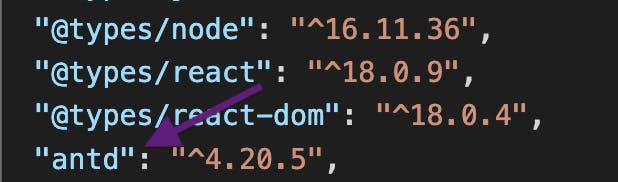
to use antd in your react app, you have to first install it(just like every other library or package you use)
npm install antd
the antd will be installed and added to your package.json file, you can check to confirm.
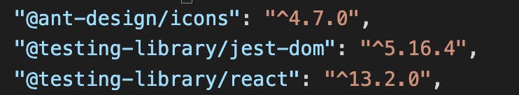
to use antd icons :
npm install @ant-design/icons
# Why antd? but why not?. Antd is a powerful library that relieves you of the burden of manually managing responsiveness across screens. It offers you easy-to-use components, components written in typescript thereby making your typescript life less miserable. Anything to reduce the red squiggly lines (type errors) that typescript brings, won't you agree?
to use any antd component in your app :
import {
  Form,
  Input,
  Button,
  Row,
  Col,
  Space,
  Upload,
  Avatar,
  DatePicker,
} from "antd";
you can separate multiple component imports with a comma, as long as they are in the same path. i.e. the path for components and icons are not the same, so you can't import components and icons together.
to import icons:
import {
  EditOutlined,
  CheckCircleFilled,
  CloseCircleFilled,
  MailFilled,
  UserOutlined,
} from "@ant-design/icons"
notice the path for icons above.
# How to customize antd styles
The antd components comes with it's own styles and colors, colors that you may or may not like. It was a bit frustrating at first trying to figure out how to override the styles, I'm glad however to have found a breakthrough (drum rolls). From my research and findings so far, there are 4 methods I know of
heads up : For my app, I used a nice css framework known as sass (which uses the .scss extension). so, if you see me mentioning .scss a lot, don't be confused.
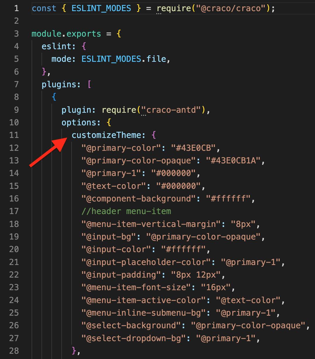
1. using a 'craco.config.js' file : This is especially for devs whose create-react-app(CRA) configuration is craco. If not, I suggest you skip this part. To do this, create a craco.config.js file in the root of your app(you probably already have this). What we want to do is add a 'customizeTheme' object inside the file. The customizeTheme allows you to target the core styles of antd and modify them. styles such as the primary-color, component-background, input-color etc. can be changed.
PS: whatever change you make here affects the component everywhere you call or use it. i.e, if you modify the 'input-color' here, that change will be applied to everywhere you use the input component in your app. so, be careful!!.
an example of what my 'craco.config.js' looks like is shown below:
2. creating custom '.scss' files : Hmmm, this method is a bit tricky, but let's dive into it. Inside your react components folder (yes that folder you store reusable component files), you can create a vendor folder, to contain all your vendor files (I'm sure you know what vendor files are right?). mine looks like this
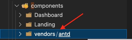 noticed that I created an antd folder inside the vendor folder?. Yes, it's to serve as a container for all my antd files.
Here, I created a css folder inside the antd folder. The css folder will contain all my style files ( for components whose styles I wish to modify). why all this folder folder?, well because as a developer, I like to be organised, makes coding fun.
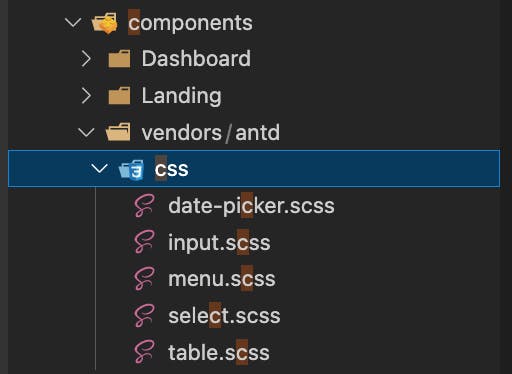
noticed how I named all the files I wish to modify in the css folder above?, looks quite organised right?, way to go!!
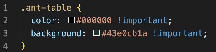
The image above is an example of my 'table.scss' file. Here, I have modified the ant-table color, and the ant-table background. why did I use the !important?, because I noticed that that is the only way to override antd inbuilt styles with this method(probably cos of my app structure and a word known as specificity). please let me know if there's a better way to do it using this method, let's learn together.
still here?, then let's move along.
If you followed the steps above, good job. However your modifications will not take effect unless you do the following:
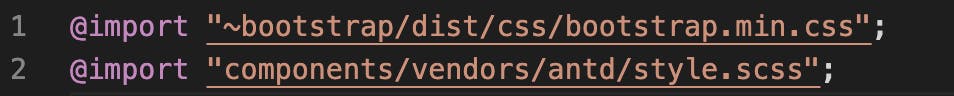
import all the files; which is why I created a 'style.scss' file inside my antd folder for this purpose.
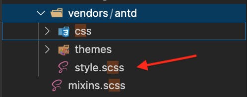
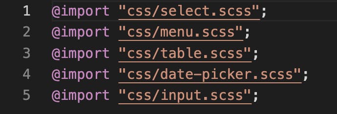
Observe how I imported all the antd files in the second screenshot above.
Import the style.scss file to use in your app;
where did I put my 'style.scss'?, Inside a 'global.scss' file. My 'global.scss' file contains all my imported styles, which in my case includes my antd styles and my bootstrap styles.
Dat's not all. to make my styles available for use in my app, I imported my 'global.scss' in my 'index.tsx' file.

Now, you can be sure that those modifications will take effect for the components.
3. using bootstrap : Bootstrap is a UI framework that is efficient and useful in responsive designs, and I love it. When I started using antd, I thought I wouldn't be able to use other UI frameworks along with it, glad I was wrong. using bootstrap along with antd allows me to secretly customize styles on components I import, using classNames.
for example :
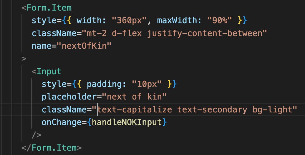
The input component in the image above is an antd component, however we can use bootstrap classes to modify it as seen above.
4. Inline css : Finally, the last and probably my best method. By adding a style attribute to the component you wish to modify and defining your own styles, as shown below.
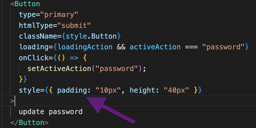
Methods 3 and 4 above are possible as a result of specificity. How?. Because bootstrap enforces a strict !important rule on its styles, and Inline styles are said to have a high specificity.
pheeew!!!...that was quite a long read. Thanks for coming this far. I'll also be dropping links to useful resources that helped my knowledge, feel free to check them out
List of resources to check out
Thank you once again for reading, and please don't forget to drop a comment or 2. more ideas and corrections are welcome!!